the Creative Commons Attribution 4.0 License.
the Creative Commons Attribution 4.0 License.
 | 03 Mar 2021
An early warning sign of critical transition in the Antarctic ice sheet – a data-driven tool for a spatiotemporal tipping point
Abd AlRahman AlMomani
Erik Bollt
Our recently developed tool, called Directed Affinity Segmentation (DAS), was originally designed for the data-driven discovery of coherent sets in fluidic systems. Here we interpret that it can also be used to indicate early warning signs of critical transitions in ice shelves as seen from remote sensing data. We apply a directed spectral clustering methodology, including an asymmetric affinity matrix and the associated directed graph Laplacian, to reprocess the ice velocity data and remote sensing satellite images of the Larsen C ice shelf. Our tool has enabled the simulated prediction of historical events from historical data and fault lines responsible for the critical transitions leading to the breakup of the Larsen C ice shelf crack, which resulted in the A-68 iceberg. Such benchmarking of methods, using data from the past to forecast events that are now also in the past, is sometimes called post-casting, analogous to forecasting into the future. Our method indicated the coming crisis months before the actual occurrence.
- Article
(3531 KB) - Full-text XML
- BibTeX
- EndNote


Warming associated with climate change causes the global sea level to rise (Mengel et al., 2016). There are three primary reasons for this, namely ocean expansion (McKay et al., 2011), ice sheets losing ice faster than it forms from snowfall and glaciers at higher altitudes melting. During the 20th century, the sea level rise has been dominated by glacier retreat. This has started to change in the 21st century because of the increased iceberg calving (Seroussi et al., 2020; Mengel et al., 2016). Ice sheets store most of the land ice (99.5 %) (Mengel et al., 2016), with a sea-level equivalent (SLE) of 7.4 m for Greenland and 58.3 m for Antarctica. Ice sheets form in areas where the snow that falls in winter does not melt entirely over the summer. Over the thousands of years of this effect, the layers have grown thicker and denser as the weight of new snow and ice layers compresses the older layers. Ice sheets are always in motion, slowly flowing downhill under their weight. Much of the ice moves through relatively fast-moving outlets called ice streams, glaciers and ice shelves near the coast. When a marine ice sheet accumulates a mass of snow and ice at the same rate as it loses mass to the sea, it remains stable. Antarctica has already experienced dramatic warming, especially the Antarctic Peninsula, jutting out into relatively warmer waters north of Antarctica, which has warmed by 2.5 ∘C (4.5 ∘F) since 1950 (NASA, 2017).
A large area of the western Antarctic Ice Sheet is also losing mass, which is attributed to warmer water upwelling from the deeper ocean near the Antarctic coast. In eastern Antarctica, no clear trend has emerged, although some stations report slight cooling. Overall, scientists believe that Antarctica is starting to lose ice (NASA, 2017), but so far, the process is not considered relatively fast, compared to the widespread changes in Greenland (NASA, 2017).
Since 1957, the current record of the continent-wide average reveals a surface temperature trend in Antarctica that has been positive and significant at >0.05 ∘C/decade (Steig et al., 2009; Gagne et al., 2015). Western Antarctica has warmed by more than 0.1 ∘C/decade in the last 50 years, and this warming is most active during the winter and spring. Although this is partly offset by autumn cooling in eastern Antarctica, this effect was prevalent in the 1980s and 1990s (Steig et al., 2009).
Of particular interest to us in this presentation is the Larsen Ice Shelf, which extends like a ribbon down from the east coast of the Antarctic Peninsula, from James Ross Island to the Ronne Ice Shelf. It consists of several distinct ice shelves separated by headlands. The major Larsen C ice crack was already noted to have started in 2010 (Jansen et al., 2015). Still, it was initially evolving very slowly, and there were no signs of radical changes according to interferometry studies of the remote sensing imagery (Jansen et al., 2010). However, since October 2015, the major ice crack of Larsen C had been growing more quickly, to the point where recently it finally failed, resulting in the calving of the massive A-68 iceberg. See Fig. 1; this is the largest known iceberg, with an area of more than 2000 square miles (5180 km2) or nearly the size of Delaware. In summary, A-68 detached from one of the largest floating ice shelves in Antarctica and floated off into the Weddell Sea.
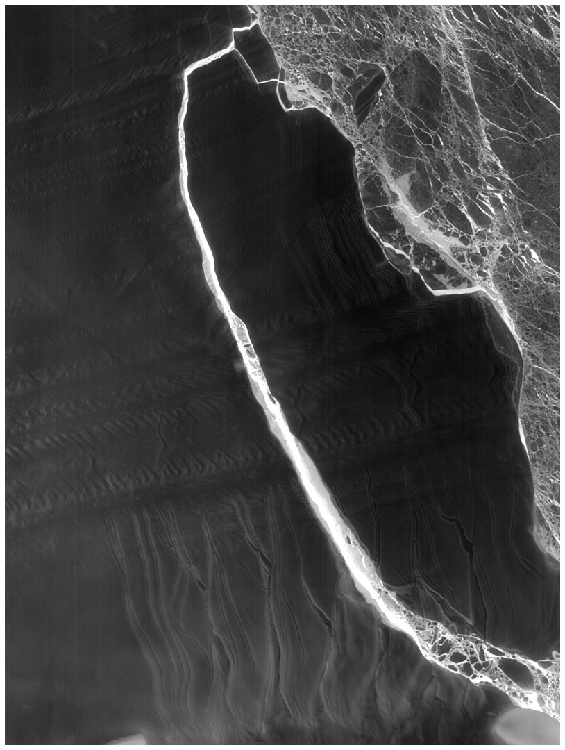
Figure 1The A-68 iceberg. The fractured berg and shelf are visible in these images, acquired on 21 July 2017, by the thermal infrared sensor (TIRS) on the Landsat 8 satellite. Credit: NASA Earth Observatory images by Jesse Allen, using Landsat data from the U.S. Geological Survey.
In Glasser et al. (2009), the authors presented a structural glaciological description of the system and a subsequent analysis of the surface morphological features of the Larsen C ice shelf, as seen from satellite images spanning the period 1963–2007. Their research results and conclusions stated that
Surface velocity data integrated from the grounding line to the calving front along a central flow line of the ice shelf indicate that the residence time of ice (ignoring basal melt and surface accumulation) is ∼560 years. Based on the distribution of ice shelf structures and their change over time, we infer that the ice shelf is likely to be a relatively stable feature, and that it has existed in its present configuration for at least this length of time.
In Jansen et al. (2010), the authors modeled the flow of the Larsen C and northernmost Larsen D ice shelves using a model of continuum mechanics of the ice flow. They applied a fracture criterion to the simulated velocities to investigate the ice shelf's stability. The conclusion of that analysis shows that the Larsen C ice shelf is inferred to be stable in its current dynamic regime. This work was published in 2010. According to analytic studies, the Larsen C ice crack already existed at that time but was considered to be growing slowly. There was no expectation, at that time, that the crack growth would proceed quickly, and that the collapse of the Larsen C was imminent.
Interferometry has traditionally been the primary technique for analyzing and predicting ice cracks based on remote sensing. Interferometry (Bassan, 2014; Lämmerzahl et al., 2001) constitutes a family of techniques in which waves, usually electromagnetic waves, are superimposed, causing the phenomenon of interference patterns which, in turn, are used to extract information concerning the viewed materials. Interferometers are widely used across science and industry to measure small displacements, refractive index changes and surface irregularities. So, it is considered a robust and familiar tool that is successful in the macroscale application of monitoring the structural health of the ice shelves. Here we will instead take a data-driven approach, directly from the remote sensing imagery, to infer structural changes indicating the impending tipping point toward Larsen C's critical transition and eventual breakup.
Figure A1 shows the interferometry image as of 20 April 2017. Although it clearly shows the crack that already existed at that time, apparently it provided no information concerning forecasting the breakup that soon followed. Just a couple of weeks after the image shown in Fig. A1, the Larsen C ice crack changed significantly and presented a different dynamic that quickly divided into two branches, as shown in Fig. A2. Interferometry is a powerful tool for detecting spatial variations in the ice surface velocity. However, when it comes to inferring the early stages of future critical transitions, it did not provide useful indications portending the important event that soon followed. Therefore, there is clearly a need for other methods that may be capable of performing this task. As we will show, our method achieves a very useful and successful data-driven early indicator of this important outcome.
In our previous work (Al Momani, 2017; AlMomani and Bollt, 2018), we developed the method of Directed Affinity Segmentation (DAS), and we showed that our method is a data-driven analogue to the transfer operator formalism designed. DAS was originally designed to characterize coherent structures in fluidic systems, such as ocean flows or atmospheric storms. Furthermore, DAS is truly a data-driven method in that it is suitable even when these systems are observed only from film data and, specifically, without either an exact differential equation or the need for the intermediate stage of modeling the vector field (Luttman et al., 2013) responsible for the underlying advection. In the current work, we apply this concept of seeking coherent structures under the hypothesis that a large ice sheet that begins to move in mass appears a great deal like a mass of material in a fluid that holds together in what is often called a coherent set.
The two most commonly used and successful image segmentation methods are based on (1) k means (Kanungo et al., 2002), and (2) spectral segmentation (Ng et al., 2002), respectively. However, while these were developed successfully for static images, they require major adjustments for successful application to sequences of images, i.e., films. The spatiotemporal problem of motion segmentation is associated with coherence, despite the fact that, traditionally, they are considered well suited to static images (Shi and Malik, 2000). The key difference between the image segmentation of static images and coherence, as related to motion segmentation, is what underlies a notion of coherent observations, since we must also consider the directionality of the arrow of time.
Defining a loss function of some kind is often the starting point when specifying an algorithm in machine learning. An affinity measure is the phrase used to describe a comparison, or cost, between states. In this case, a state may be the measured attributes at a given location in an image scene. However, when there is an underlying arrow of time, the loss functions that most naturally arise to track coherence will not be inherently symmetric. Correspondingly, affinity matrices associate the affinity measure for each pairwise comparison across a finite data set. A graph is associated with the affinity matrix where there is an edge between each state for which there is a nonzero affinity. Generally, in the symmetric case, these graphs are undirected. Now consider that if the affinity matrices are not symmetric, then these are associated with directed graphs, which describes the arrow of time. This is a theoretical complication of standard methodology since many of the theoretical underpinnings of the standard spectral partitioning assume a symmetric matrix corresponding to an undirected graph and then consider the spectrum of eigenvalues of the corresponding symmetric graph Laplacian matrix that follows. This new case can be accommodated by the spectral graph theory, as there is a graph Laplacian for weighted directed graphs built upon the theoretical work of Fan Chung (Chung and Oden, 2000). Our own work in AlMomani and Bollt (2018) specialized this concept of the directed spectral graph theory to the scenario of image sequences derived from an assumed underlying evolution operator.
To proceed with our directed partitioning method, we formulate the (film) imagery sequences data set as the following matrices:
where each Xi is the ith image (or the image at ith time step) and describes a d1×d2 pixelated image reshaped as a column vector, d×1 and d=d1d2 (see Fig. 2). This describes a grayscale image, but in the likely scenario of multiple attributes or color bands at each pixel, then these data structures likewise include the corresponding tensor depth. Here, τ is the time delay and 𝒳0 and 𝒳τ are the images sequences stacked as column vectors with a time delay at the current and future times, respectively. Choosing the value of the time delay τ can result in significant differences in the segmentation process. Consider that, in the case of a relatively slowly evolving dynamical system where the change between two consecutive images is not significantly distinguishable, choosing a large value for τ may be better suited. In our work, we considered the mean image over a period of 1 month as a moving window generating our images, which implies τ to be 1 month.
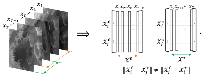
Figure 2Directed partitioning method. We see the image sequence to the left, and to the right, we reshape each image as a single column vector. Following the resultant trajectories, we see that the pairwise distance between the two matrices will result in an asymmetric matrix. Raw images sourced from Scambos et al. (1996).
Note that the rows of represent the change in the color of the pixel at a fixed spatial location zi. It is crucial to keep in mind that we chose the color as the evolving quantity for a designated spatial location for clarity and consistency with our primary application and approach described in this paper. However, we can select the evolving quantity to be the magnitude of the pixels obtained from spectral imaging or experimental measures obtained from the field such as pressure, density or velocity. Section 3 introduces examples where the ice surface velocity was used instead of the color to highlight how the results may vary based on the selected measure.
We introduced (AlMomani and Bollt, 2018) an affinity matrix in terms of a pairwise distance function between the pixels i and j as follows:
where the function is used to define the spatial distance between pixels i and j describing physical locations zi and zj. The function is a distance function describing the color distance between the ith and the jth color channels. The parameter α≥0 regularizes, balancing these two effects. The value of α can be seen as a degree of importance of the function 𝒞 relative to the spatial change. Large values of α will make the color variability dominate the distance in Eq. (3), and it would classify very close (spatially) regions as different coherent sets when they have small color differences. On the other hand, small values of α may classify spatially neighboring regions as one coherent set, even when they have a significant color difference. In our work, the color is quantified as a grayscale color of the images (). So, we scaled the value of 𝒮 to be in [0,1], then we choose α=0.25 to emphasize spatial change, where we choose the functions 𝒮 and 𝒞 each to be L2 distance functions, as follows:
and
We see that the spatial distance matrix 𝒮 is symmetric. However, the color distance matrix 𝒞 is asymmetric for all τ>0. While the matrix generated by refers to the symmetric case of spectral clustering approaches, we see that the matrix given by , τ>0 implies an asymmetric cost naturally due to the directionality of the arrow of time. Thus, we require that an asymmetric clustering approach must be adopted.
First, we define our affinity matrix from Eq. (3) as follows:
This has the effect that both the spatial and measured (color) effects almost have Markov properties, as far-field effects are almost forgotten in the sense that they are almost zero. Likewise, near-field values are the largest. Notice that we have suppressed including all the parameters in writing 𝒲i,j, including time parameter τ that describes sampling history and the parameters α and σ that serve to balance the spatial scale and resolution of color histories.
We proceed to cluster the spatiotemporal regions of the system, in terms of the directed affinity 𝒲, by interpreting the problem as random walks through the weighted directed graph, , designed by 𝒲 as a weighted adjacency matrix. In the following, let:
where
is the degree matrix, and 𝒫 is a row stochastic matrix representing the probabilities of a Markov chain through the directed graph G. Note that because 𝒫 is row stochastic, this implies that it row sums to one. This is equivalently stated that the right eigenvector is the one vector, 𝒫1=1, but the left eigenvector corresponding to left eigenvalue, 1, represents the steady state row vector of the long-term distribution, as follows:
Consider that, for example, if 𝒫 is irreducible, then has all positive entries, uj>0 for all j or, as said for simplicity of notation, u>0, which is interpreted componentwise. Let Π be the corresponding diagonal matrix, as follows:
and likewise,
which is well defined for either ± sign branch when u>0.
Then, we may cluster the directed graph using the spectral graph theory methods specialized for directed graphs, following the weighted directed graph Laplacian described by Fan Chung (Chung, 2005). A similar computation has been used for transfer operators in Froyland and Padberg (2009); Hadjighasem et al. (2016) and as reviewed in (Bollt and Santitissadeekorn, 2013; Santitissadeekorn and Bollt, 2007; Bollt et al., 2012), including in oceanographic applications. The Laplacian of the directed graph G is defined (Chung, 2005) as follows:
The first, smallest eigenvalue larger than zero, λ2>0, is such that, in the following:
allows a bipartition by the sign structure of the following:
Analogously to the Ng–Jordan–Weiss symmetric spectral image partition method (Ng et al., 2002), the first k eigenvalues larger than zero, and their eigenvectors, can be used to associate a multipart partition, by the assistance of the k-means clustering of these eigenvectors. By defining the matrix that has the eigenvectors associated with the kth most significant eigenvalues on its columns, we then use the k-means clustering to multi-partition V, based on the L2 distance between the rows of V. Since each row in the matrix V is associated with a specific spatial location (pixel), by reshaping the labels vector that results from the k-means clustering, we obtain our labeled image.
We apply DAS to satellite images of the Larsen C ice shelf and ice surface velocity data. Here we show that the DAS of spatiotemporal changes can work as an early warning sign tool for critical transitions in marine ice sheets. We applied our post-casting experiments on Larsen C images before the splitting of the A-68 iceberg, and then we compared our forecasting, based on segmentation, to the actual unfolding of the event.
In Fig. 3, we see different snapshots of the ice surface velocity data set (Rignot et al., 2017, 2011; Mouginot et al., 2012), which are part of the NASA Making Earth System Data Records for Use in the Research Environments (MEaSUREs) program. It provides the first comprehensive Rignot et al. (2017), high-resolution, digital mosaics of ice motion in Antarctica assembled from multiple satellite interferometric synthetic aperture radar systems. We apply our directed affinity partitioning algorithm to these available data sets, and the results are shown as a labeled image in Fig. 4.
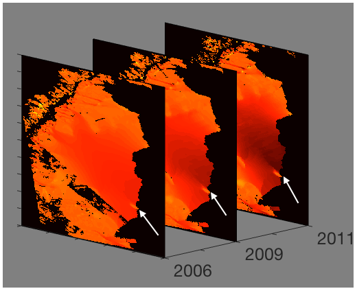
Figure 3Ice surface velocity. The figure shows the data set for 3 different years around the beginning of the Larsen C ice crack in 2010. The data from the years 2007, 2008 and 2010 are corrupted on the region of interest, and they are excluded. The color scale indicates the magnitude of the velocity from light red (low velocity) to dark red (high velocity), and the arrow points to the starting tip of the crack. The result of the directed partitioning is shown in Fig. 4. Data sourced from Rignot et al. (2017).
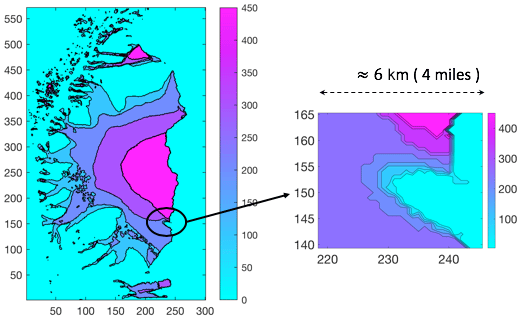
Figure 4Directed affinity result. The directed partitioning (left) results for the ice surface velocity of 2006, 2009, 2011 and 2012. Note that the ice shelf crack started in 2010. A narrow field magnifying the region of interest (right) shows large variations in ice surface velocity within a small area to give a clearer focused view of the differences in speeds. In Appendix B, Fig. B1 shows the surface plot for the same result.
As shown in Fig. 4, we note the following:
-
The data were collected from eight different sources (Rignot et al., 2017), with different coverage and various error ranges, and interpolating the data from these different sources explains the smooth curves in segmentation around the region of interest.
-
The directed partitioning shows the Larsen C ice shelf as a nested set of coherent structures that are contained successively within each other.
-
The magnified view shown in the inset of Fig. 4 highlights the region where the Larsen C ice crack starts. Furthermore, we see a significant change in velocity within a narrow spatial distance (4 miles; 6.44 km). More precisely, the outer boundaries of the coherent sets become spatially very close (considering the margin of error in the measurements; Rignot et al., 2017). We conclude that, likely, these have contact.
Directed partitioning gives us informative clustering, meaning that each cluster has homogeneous properties, such as the magnitude and the direction of the velocity. Consider the nested coherent sets, , shown in Fig. 5. Each set Ai−1 maintains its coherence within Ai because of a set of properties (i.e., chemical or mechanical properties) that rules the interaction between them. However, observe that the contact between the boundaries of the sets Ai−1 and Ai can mean a direct interaction between dissimilar domains. These later sets may significantly differ in their properties, such as a significant difference of velocity, which may require different analysis under different assumptions than the gradual increase in the velocity.
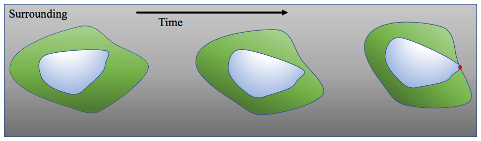
Figure 5The dynamic of two coherent sets. As the inner set contacts the boundary of the outer one, it gives the chance for new reactions that may cause a critical transition.
However, since the boundaries of the sets are not entirely contacted, the directions of the velocities reveal no critical changes; we believe this results implicitly from the data preprocessing that includes interpolation and smoothing of the measurements. We believe that the interpolation and smoothing of the measurements cause loss in data informativity about critical transitions. Our method, using the ice surface velocity data, was able to detect more details. However, it still cannot detect critical transitions such as the crack branching, as discussed in the introduction and as shown in Fig. A2. Based on our results using the ice velocity data, we state nothing more than such close interaction between coherent set boundaries. As shown in Fig. 4, an early warning sign should be considered and investigated by applying the potential hypothesis (what-if assumptions) and analyzing the consequences from any change or any error in the measured data.
It is interesting to contrast our directed partitioning results, which give early indications of impending fracture changes using the remote sensing satellite images, to classical interferometry analysis methods (Scambos et al., 1996). To reduce the obscuration effects of noise (clouds and images of variable intensity), we used the averaged images, over 1 month, as a single snapshot for the directed affinity constructions. We excluded some images that have high noise and a lack of clarity in the region of interest (see Fig. B8). Figure 6, the directed affinity partitioning for two time windows, starts from December 2015. Notice that the directed partitioning begins to detect the Larsen C ice shelf's significant change in July 2016. In Fig. 7, we see that, by September 2016, we detect a structure very close in shape to the eventual and actual iceberg A-68, which calved from Larsen C in July 2017. Moreover, by November 2016 (see Fig. B2), the boundaries of the detected partitions match the crack dividing into two branches that happened later in May 2017 (shown in Fig. A2).

Figure 6For two time windows (top and bottom), we see the mean image (left) of the images included in the window, the DAS labeled clusters (middle) and the overlay of the DAS boundaries (right) over the mean image of the window. We took these two time windows from February and July 2016 as a detailed example, and more time window results are shown in Fig. 7. During 2016, there was no significant change in the Larsen C crack at the beginning of the year. However, in July 2016, based solely on data up to that point in time, the DAS proposed a large change in the crack dynamics, and this change continued faster, as Fig. 7 shows. Raw images sourced from Scambos et al. (1996).
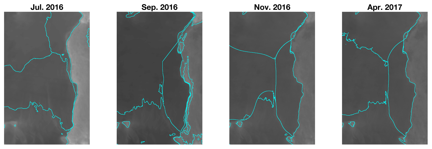
Figure 7Complementing Fig. 6, this figure shows the DAS boundaries (right) for different time windows, starting from July 2016 to April 2017. Raw images sourced from Scambos et al. (1996).
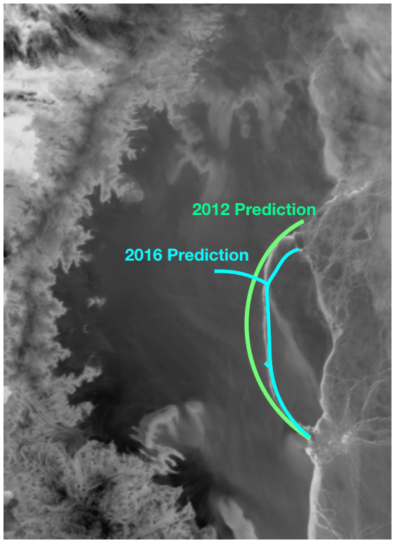
Figure 8The 2012 prediction based on ice surface velocity data, and the 2016 prediction based only on satellite images, compared to the actual crack (white curve between the two prediction curves) on July 2017, as shown in Fig. 1. Raw image sourced from Scambos et al. (1996).
We have shown that our data-driven approach, originally developed for detecting coherent sets in fluidic systems, shows promise for predicting possible critical transitions in spatiotemporal systems, specifically for marine ice sheets, based on remote sensing satellite imagery. Our approach shows reliability in detecting coherent structures when the object of concern is a quasi-rigid body such as ice sheets. The main idea is that observing a significant and perhaps topological form change of a coherent structure may indicate an essential underlying critical structural change in the ice over time. The computational approach is based on spectral graph theory in terms of the directed graph Laplacian. We have shown here that carefully designing a directed affinity matrix, which accounts for balancing spatial distance and measurements at spatial sites, for application of spectral graph theory is relevant in our applied setting of remote sensing imagery. In the case of the Larsen C ice shelf, we have carried forward this data-driven program. We successfully observe the calving event of the A-68 iceberg and some critical transitions months before their actual occurrence. This transition in the coherent structure can indicate, by directed affinity partitioning, a possible fracture. We see that the directed affinity partitioning can be a useful early warning sign that indicates the possibility of critical spatiotemporal transitions, and it may help to bring the attention to specific regions in order to investigate different possible scenarios in the analytic study, whether these are further computational analyses or possibly even supporting further field studies and deployed aerial remote sensing missions. We have demonstrated that, in the case of the Larsen C ice shelf event, with the evidence in Figs. 6–8 and B1–B7, potentially important events may be observable months ahead of the final outcome.
In our future work, we plan to pursue the idea of connecting our data-driven approach to computing boundaries by directed partitioning with the computational science approach in terms of stress/strain analysis of rigid bodies and an understanding of the underlying physics.
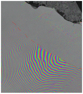
Figure A1Interferometry (20 April 2017) in which two Sentinel-1 radar images from 7 and 14 April 2017 were combined to create an interferogram showing the growing crack in Antarctica's Larsen C ice shelf. Polar scientist Anna Hogg said, “We can measure the iceberg crack propagation much more accurately when using the precise surface deformation information from an interferogram like this rather from than the amplitude (or black and white image) alone, where the crack may not always be visible.” Sourced from Agency (2017).
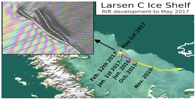
Figure A2The Larsen C crack development (new branch) as of 1 May 2017. Labels highlight significant jumps, and the tip positions are derived from Landsat (USGS) and Sentinel-1 InSAR (ESA) data. The background image blends Bedmap2 elevation (BAS) with a MODIS MOA2009 Image Map (NSIDC). Other data are from the Scientific Committee on Antarctic Research Antarctic Digital Database (SCAR ADD) and OpenStreetMap (OSM). Credit: Project MIDAS (Impact of Melt on Ice Shelf Dynamics And Stability); Adrian John Luckman, Swansea University.

Figure B1Directed affinity partitions, with the mean velocity (speed) of the partition assigned for each label entry. The spatial distance between the arrow tips is less than 2 miles (3.22 km), while the difference in the speed is more than 200 m/yr.

Figure B2The mean image and the directed affinity partitioning as of November 2016. The results show a similar structure to the crack branching that occurred on May 2017 (shown in Fig. A2) and a similar structure to the final iceberg that calved from Larsen C on July 2017. Raw images sourced from Scambos et al. (1996).

Figure B3The mean image and the directed affinity partitioning as of February 2016. Raw images sourced from Scambos et al. (1996).
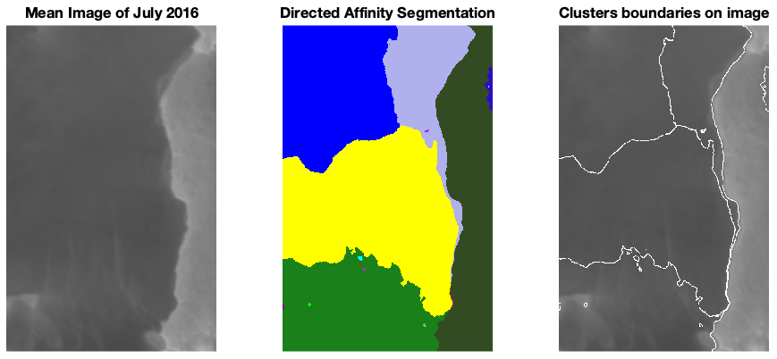
Figure B4The mean image and the directed affinity partitioning as of July 2016. Raw images sourced from Scambos et al. (1996).
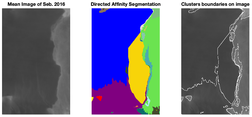
Figure B5The mean image and the directed affinity partitioning as of September 2016. Raw images sourced from Scambos et al. (1996).
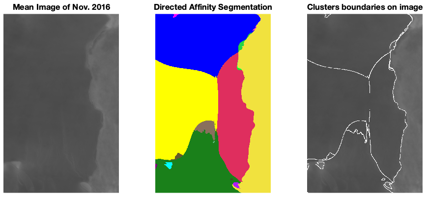
Figure B6The mean image and the directed affinity partitioning as of November 2016. Raw images sourced from Scambos et al. (1996).
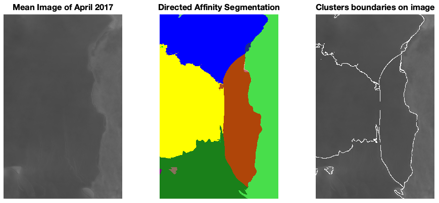
Figure B7The mean image and the directed affinity partitioning as of April 2017. Raw images sourced from Scambos et al. (1996).
.
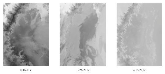
Figure B8Example of noisy images that have been excluded when computing the average image. Raw images sourced from Scambos et al. (1996)
The data of this study are available from the authors upon reasonable request.
Each author contributed approximately 50 %, in terms of time and effort, to this project. EB developed conceived the background theory, was involved in the design of experiments and wrote much of the paper. AAA implemented theory, developed the specific experimental design, codes and analysis and also wrote much of the paper.
The authors declare that they have no conflict of interest.
This work was funded in part by the Army Research Office, the Naval Research Office and also the Defense Advanced Research Projects Agency (DARPA).
This research has been supported by the Army Research Office (grant no. N68164-EG) and the Office of Naval Research (grant no. N00014-15-1-2093).
This paper was edited by Juan Restrepo and reviewed by two anonymous referees.
Agency, E. S.: ESR: Larsen C Crack Interferogram. Contains modified Copernicus Sentinel data (2017), processed by A. Hogg/CPOM/Priestly Centre, available at: https://www.esa.int/ESA_Multimedia/Images/2017/04/Larsen-C_crack_interferogram, (last access: 28 April 2020), 2017. a
AlMomani, A. and Bollt, E.: Go With the Flow, on Jupiter and Snow. Coherence from Model-Free Video Data Without Trajectories, J. Nonlinear Sci., 30, 2375–2404, https://doi.org/10.1007/s00332-018-9470-1, 2018. a, b, c
Al Momani, A. A. R. R.: Coherence from Video Data Without Trajectories: A Thesis, PhD thesis, Clarkson University, USA, 2017. a
Bassan, M.: Advanced interferometers and the search for gravitational waves, Astrophys. Space Sc. L., 404, 275–290, 2014. a
Bollt, E. and Santitissadeekorn, N.: Applied and Computational Measurable Dynamics, Society for Industrial and Applied Mathematics, ISBN 978-1-611972-63-4, https://doi.org/10.1137/1.9781611972641, 2013. a
Bollt, E. M., Luttman, A., Kramer, S., and Basnayake, R.: Measurable dynamics analysis of transport in the Gulf of Mexico during the oil spill, Int. J. Bifurcat. Chaos, 22, 1230012, https://doi.org/10.1142/S0218127412300121, 2012. a
Chung, F.: Laplacians and the Cheeger inequality for directed graphs, Ann. Comb., 9, 1–19, 2005. a, b
Chung, F. and Oden, K.: Weighted graph Laplacians and isoperimetric inequalities, Pac. J. Math., 192, 257–273, https://doi.org/10.2140/pjm.2000.192.257, 2000. a
Froyland, G. and Padberg, K.: Almost-invariant sets and invariant manifolds – Connecting probabilistic and geometric descriptions of coherent structures in flows, Physica D, 238, 1507–1523, https://doi.org/10.1016/j.physd.2009.03.002, 2009. a
Gagne, M., Gillett, N., and Fyfe, J.: Observed and simulated changes in Antarctic sea ice extent over the past 50 years, Geophys. Res. Lett., 42, 90–95, 2015. a
Glasser, N. F., Kulessa, B., Luckman, A., Jansen, D., King, E. C., Sammonds, P. R., Scambos, T. A., and Jezek, K. C.: Surface structure and stability of the Larsen C ice shelf, Antarctic Peninsula, J. Glaciol., 55, 400–410, https://doi.org/10.3189/002214309788816597, 2009. a
Hadjighasem, A., Karrasch, D., Teramoto, H., and Haller, G.: Spectral-clustering approach to Lagrangian vortex detection, Phys. Rev. E, 93, 063107, https://doi.org/10.1103/PhysRevE.93.063107, 2016. a
Jansen, D., Kulessa, B., Sammonds, P. R., Luckman, A., King, E. C., and Glasser, N. F.: Present stability of the Larsen C ice shelf, Antarctic Peninsula, J. Glaciol., 56, 593–600, https://doi.org/10.3189/002214310793146223, 2010. a, b
Jansen, D., Luckman, A. J., Cook, A., Bevan, S., Kulessa, B., Hubbard, B., and Holland, P. R.: Brief Communication: Newly developing rift in Larsen C Ice Shelf presents significant risk to stability, The Cryosphere, 9, 1223–1227, https://doi.org/10.5194/tc-9-1223-2015, 2015. a
Kanungo, T., Mount, D., Netanyahu, N., Piatko, C., Silverman, R., and Wu, A.: An efficient k-means clustering algorithm: analysis and implementation, IEEE T. Pattern Anal., 24, 881–892, https://doi.org/10.1109/TPAMI.2002.1017616, 2002. a
Lämmerzahl, C., Everitt, C. F., and Hehl, F. W.: Gyros, Clocks, Interferometers...: Testing Relativistic Gravity in Space, Springer-Verlag Berlin Heidelberg, ISBN 978-3-540-41236-6, 2001. a
Luttman, A., Bollt, E. M., Basnayake, R., Kramer, S., and Tufillaro, N. B.: A framework for estimating potential fluid flow from digital imagery, Chaos: J. Nonlinear Sci., 23, 033134, https://doi.org/10.1063/1.4821188, 2013. a
McKay, N. P., Overpeck, J. T., and Otto-Bliesner, B. L.: The role of ocean thermal expansion in Last Interglacial sea level rise, Geophys. Res. Lett., 38, https://doi.org/10.1029/2011GL048280, 2011. a
Mengel, M., Levermann, A., Frieler, K., Robinson, A., Marzeion, B., and Winkelmann, R.: Future sea level rise constrained by observations and long-term commitment, P. Natl. Acad. Sci. USA, 113, 2597–2602, https://doi.org/10.1073/pnas.1500515113, 2016. a, b, c
Mouginot, J., Scheuchl, B., and Rignot, E.: Mapping of Ice Motion in Antarctica Using Synthetic-Aperture Radar Data, Remote Sens., 4, 2753–2767, https://doi.org/10.3390/rs4092753, 2012. a
NASA: NASA National Snow and Ice Data Center Distributed Active Archive Center., available at: https://nsidc.org/cryosphere/quickfacts/icesheets.html (last access: 17 April 2020), 2017. a, b, c
Ng, A. Y., Jordan, M. I., and Weiss, Y.: On spectral clustering: Analysis and an algorithm, Adv. Neur. In., 2, 849–856, available at: https://dl.acm.org/doi/10.5555/2980539.2980649 (last access: 2 March 2021), 2002. a, b
Rignot, E., Mouginot, J., and Scheuchl, B.: Ice Flow of the Antarctic Ice Sheet, Science, 333, 1427–1430, https://doi.org/10.1126/science.1208336, 2011. a
Rignot, E., Mouginot, J., and Scheuchl, B.: MEaSUREs InSAR-Based Antarctica Ice Velocity Map, Version 2, [subset:2006-2011], Boulder, Colorado USA, NASA National Snow and Ice Data Center Distributed Active Archive Center, available at: https://nsidc.org/data/nsidc-0484/versions/2 (last access: 17 September 2018), 2017. a, b, c, d, e
Santitissadeekorn, N. and Bollt, E.: Identifying stochastic basin hopping by partitioning with graph modularity, Physica D, 231, 95–107, 2007. a
Scambos, T., Bohlander, J., and Raup., B.: Images of Antarctic Ice Shelves, MODIS Antarctic Ice Shelf Image Archive, available at: http://nsidc.org/data/iceshelves_images/index_modis.html (last access: 17 September 2018-09-17) 1996. a, b, c, d, e, f, g, h, i, j, k, l
Seroussi, H., Nowicki, S., Payne, A. J., Goelzer, H., Lipscomb, W. H., Abe-Ouchi, A., Agosta, C., Albrecht, T., Asay-Davis, X., Barthel, A., Calov, R., Cullather, R., Dumas, C., Galton-Fenzi, B. K., Gladstone, R., Golledge, N. R., Gregory, J. M., Greve, R., Hattermann, T., Hoffman, M. J., Humbert, A., Huybrechts, P., Jourdain, N. C., Kleiner, T., Larour, E., Leguy, G. R., Lowry, D. P., Little, C. M., Morlighem, M., Pattyn, F., Pelle, T., Price, S. F., Quiquet, A., Reese, R., Schlegel, N.-J., Shepherd, A., Simon, E., Smith, R. S., Straneo, F., Sun, S., Trusel, L. D., Van Breedam, J., van de Wal, R. S. W., Winkelmann, R., Zhao, C., Zhang, T., and Zwinger, T.: ISMIP6 Antarctica: a multi-model ensemble of the Antarctic ice sheet evolution over the 21st century, The Cryosphere, 14, 3033–3070, https://doi.org/10.5194/tc-14-3033-2020, 2020. a
Shi, J. and Malik, J.: Normalized cuts and image segmentation, IEEE T. Pattern Anal., 22, 888–905, https://doi.org/10.1109/34.868688, 2000. a
Steig, E. J., Schneider, D. P., Rutherford, S. D., Mann, M. E., Comiso, J. C., and Shindell, D. T.: Warming of the Antarctic ice-sheet surface since the 1957 International Geophysical Year, Nature, 457, 459–462, 2009. a, b